Most of software products websites look almost the same. I don’t know, too serious, too official. And I wanted to redesign F7’s website to look more funny, more friendly, maybe more playfully. In the end why not, why everything should look the same?
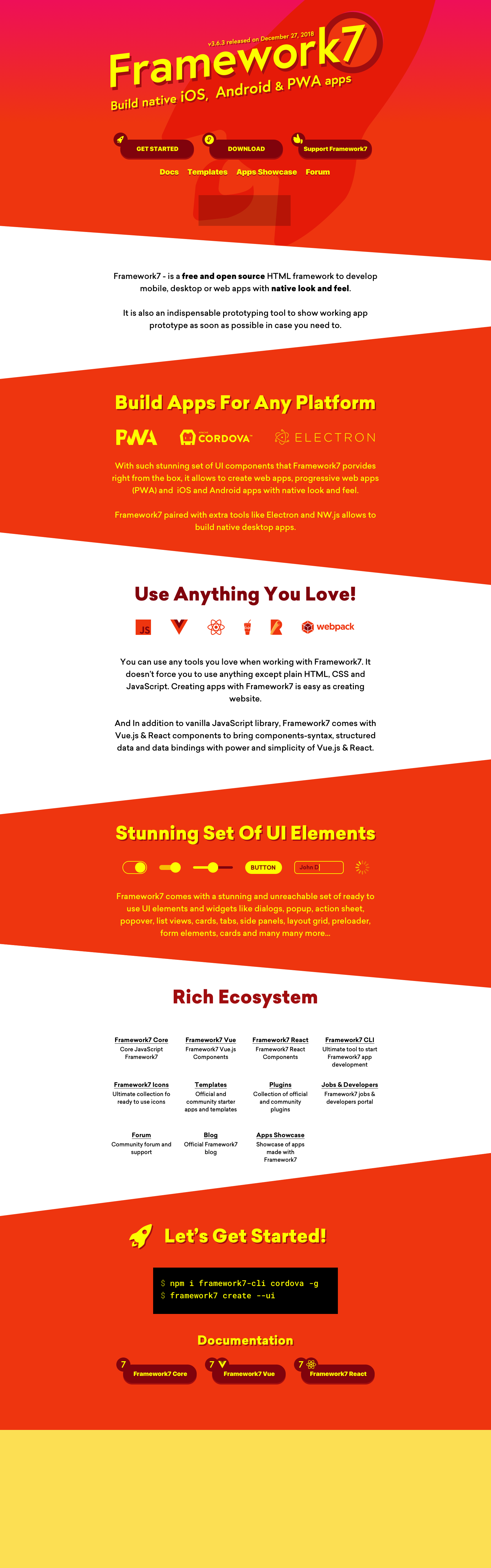
So I sketched up new home page design that will also dictate new branding. It is done in kind of retro-futuristic style.
So what do you think? Do you like it? Does it look fresh, better, more interesting than what we have now?
IMHO, the current website is very functional and clean. Your current logo is outstanding and a white background makes the content easy to read. I suggest that you might consider to build a second website for a different target group. The layout presented above seems to me more applicable for designers who want to build an App/PWA or website without to much hassle.
I do like the elevated “Framework 7” title on a slope. The font and especially the 7 seems very nice.
Do not forget that your landing page an in particular the top is a very strong and interesting view ! Especially the demo on the right is extremely useful to demonstrated the capabilities of F7. Below the red zone on your current page, some modernisation might be applicable to make it more sparkling. (however no idea how to do that)
I dont try to promote my website, but wanted just to show you that design, let me explain the my ideas: maybe you could take some inspiration from it:
Every Section is dedicated to one Feature or Message, and there for has kind of its own design & orientation of / dont know hot to call them in css they are just triangles.
I would suggest that you aswell take that aproach to give every section its own design within the framework of the / & \
just some thoughts
I believe that if you remove the 7 it will be very difficult to position “framework” in the search engines both to seek help and for new users.
Another topic I like red and yellow is more “cool” and I vote for documentation to be kept how it is now.
I agree with insulae: don’t loose the 7 !
Red and yellow is more vibrant but there is a choice: professional & borrowing or … lively and / but more playful.
Good to read that the documentation stays red & white.
我用中文来说好吗?
你原来的设计思路很好,到现在被用的太多了。作为一个框架,我们不可能将它设计成另一种语言。所以我们应用F7并不是真正创造什么根本上的变革。让枯燥的工作更有趣一些是非常好的想法!不过鉴于F7提供的动画处理并不见长,我的拙见是不要太表达动感。整理一下组建的参数描述是很有必要的,不然对于新人,哪些参数是必须的,哪些又是可选的有些无法明了。strong text
Yeah, removing “7” from title not an option right now. It is already known as Framework7 so would be hard to explain what it is. I even had an idea to change the name to something different, but due to the same reason, not an option right now.
Was thinking about it, but maybe a bit later, as a bunch of extra work on this
I also agree about the DC comics comment. I was thinking Flash (if that is DC) as soon as I saw it.
I think Framework7 is a good name as it is and your site/support are excellent as they are, thanks so much. I am sure your update will also be awesome. Congrats on building this!
Rebranding is always fun, but don’t forget the core imagery that will instantly explain to your visitors what it is you do: An image of your framework running on a mobile device! I like the current homepage how you can jump into the kitchen sink, but even just an animated gif showing the framework in action would be useful within a redesign.