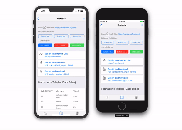
I run into this problem too when testing a PWA on an iPhone 6s. Not only after rotating from portrait to landscape and back but also with grid layouts being shifted because of the additional 20px of the status bar.
To be clear, in Safari everything looks great, but these effects appear after adding the App to the Home screen.
I found the following solution here provide by Damien. He figured out that it’s a problem with using viewport-fit=cover.
To get around the problem he suggests to set conditionally the viewport-fit property by adding this bit of script to index.html
if (window.navigator.standalone) {
document.querySelector('meta[name=viewport]').setAttribute('content', 'width=device-width, initial-scale=1.0, minimum-scale=1.0, maximum-scale=1.0, user-scalable=no');
}
This detects if we are in a standalone web app mode and if so: modify the viewport metatag to be one without viewport-fit=cover. The original metatag is:
<meta name="viewport" content="width=device-width, initial-scale=1.0, minimum-scale=1.0, maximum-scale=1.0, user-scalable=no, viewport-fit=cover">;
It works for me on an iPhone 6s but I have to confess, I don’t have an iPhone X.
In my opinion this is a flaw in the design of iOS but some others call this bug a feature.
At least that is the opinion of Maximiliano Firtman, in his response to Damien :
If you use the cover-fit viewport attribute you are opting in into being in charge of unsafe areas (such as the notch area on iPhone X), so that’s why the PWA gets a fully fullscreen mode. When you use that viewport tag you should also use the CSS env() properties to add paddings for safe areas.
Hmm… not sure what to think about that.