I have eight cards which, on a smartphone, look fine one below the other - but, I’m wondering if cards can be laid out in a grid for better use of screen estate on a tablet?
Ideas/suggestion appreciated…
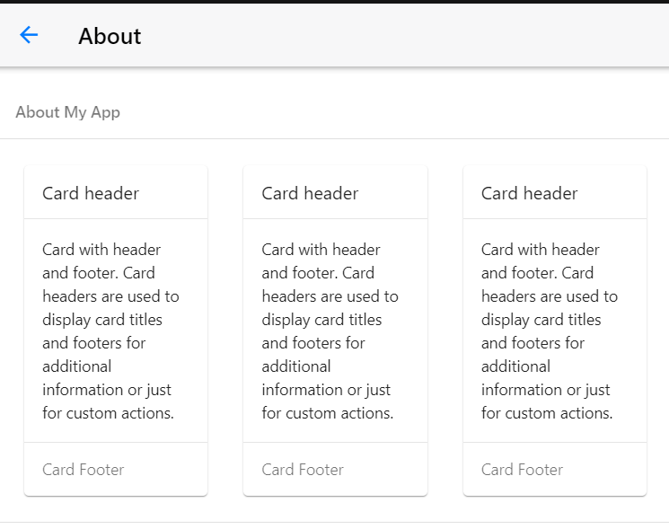
just an example,
        <div class="row">
          <div class="col-33">
            <div class="card">
              <div class="card-header">Card header</div>
              <div class="card-content card-content-padding">
                Card with header and footer. Card headers are used to display
                card titles and footers for additional information or just for
                custom actions.
              </div>
              <div class="card-footer">Card Footer</div>
            </div>
          </div>
        </div>
      </div>
you can use grids to achieve what you want
1 Like
Thanks - yoru solution appreciated…