Hi,
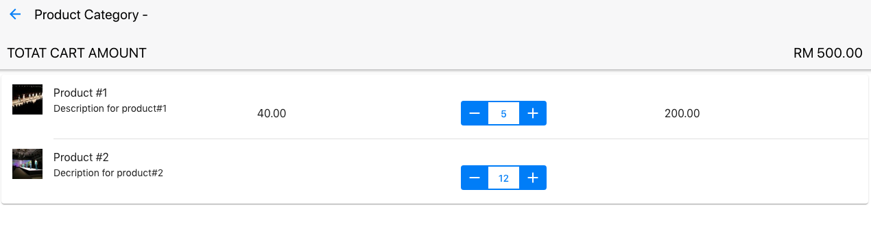
I have a screen of a product selector screen, and I would like to find out how can i
achieve of hiding when in a smaller device, like “medium-only” class, which
i applied but no result,
and

i am using the following in my HTML template,
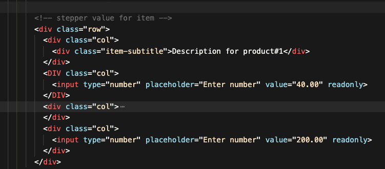
and can see that the class is “col”, what can i do to hide the 2 columns?
40.00 and 200.00 column?