Hi, i have called at mounted of a page as follow,
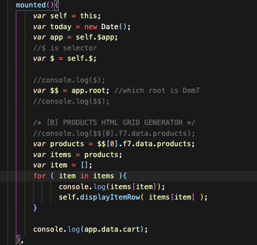
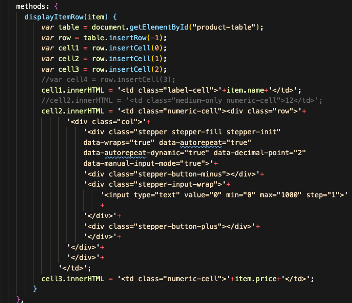
but as u notice the displayItemRow( … ) function,
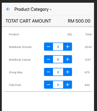
so my issue is that when it is on a mobile device, it displays fine.
but when it displays in a bigger screen size, i.e. desktop browser,
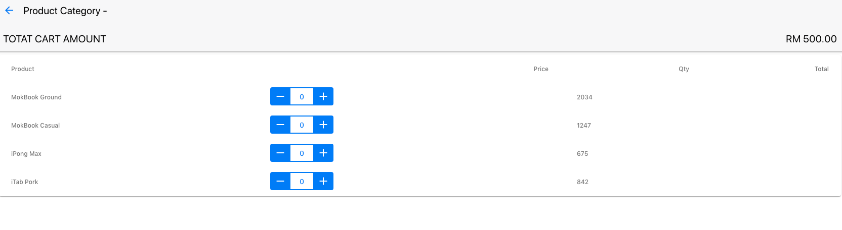
now my issue is that i do not know how to get the column to hide when i m
in a device mode and when i am on a desktop , the table should show more
columns,
and i know, we can detect device to display differently but is there a good practice
of doing this?
and also the table header and the table row , suppose to align as per the label-numeric
and label-cell but not sure why , if u check my image above, the label, not sure
what to do , in my context to align with the values of the row , column by
column ?
appreciate any input or advice ,
thanks.
kalmen