I have an app built with the F7 CLI back in December 2019. For my dashboard page, I want an image to fill the status bar for the iPhone X series and above. I have put
<meta name="viewport" content="width=device-width, height=device-height, initial-scale=1, maximum-scale=1, minimum-scale=1, user-scalable=no, minimal-ui, viewport-fit=cover">
in my index.html, and I have also installed the Cordova splashscreen and status bar plugins. I have the following in my config.xml file:
<platform name="ios">
    <preference name="StatusBarOverlaysWebView" value="true" />
    <splash src="res/screen/ios/Default@2x~universal~anyany.png" />
</platform>
I have also added app.statusbar.hide(); when initializing my Framework7 app, but it still doesn’t work. I followed the following tutorials:
but I’m still unable to get my image to fill the status bar. If anyone can help that would be appreciated. Thank you.
For reference, this is what it looks like on the simulator:
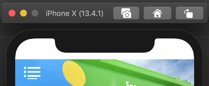
I want my image to fill the white parts
HTML & CSS code for reference:
<template>
<div class="page no-navbar" data-name="dashboard-page">
<div class="page-content" id="dashboard-page-content">
<div class="row banner-container">
<div class="col banner">
<!--Image-->
<img src="static/images/ts2.jpg" class="banner-img">
<!--Menu-->
<div class="menu menu-dashboard">
<div class="menu-inner">
<div class="menu-item menu-item-dropdown">
<div class="menu-item-content">
<i class="icon f7-icons if-not-md size-3-em dashboard-menu-colour">menu</i>
<i class="icon material-icons md-only size-3-em dashboard-menu-colour">menu</i>
</div>
<div class="menu-dropdown menu-dropdown-left">
<div class="menu-dropdown-content">
<a href="/requestview/" class="menu-dropdown-link menu-close text-color-menu">View My Requests</a>
<div class="menu-dropdown-divider"></div>
<a href="/terms/" class="menu-dropdown-link menu-close text-color-menu">Terms & Conditions</a>
<div class="menu-dropdown-divider"></div>
<a href="/privacy/" class="menu-dropdown-link menu-close text-color-menu">Privacy Notice</a>
<div class="menu-dropdown-divider"></div>
<a href="#" class="menu-dropdown-link menu-close text-color-menu" id="logout-btn">Logout</a>
</div>
</div>
</div>
</div>
</div>
<!--Text-->
<p class="custcare">CUSTOMER CARE</p>
</div>
</div>
</div>
</div>
</template>
.banner{
    min-height: 100%;
    height: 100%;
    width: 100%;
    position: relative;
}

.banner-img{
    height: 100%;
    width: 100%;
}

.banner-container{
    width: 100%;
    height: 27%;
}

div#dashboard-page-content {
    max-height: 100%;
    overflow: hidden;
}
UPDATE
setting the margin of banner-container to a negative value solves the problem, but it affects how it looks on iPhones that do not have the same style as the X series (iPhone 6-8). on these iPhones, the top part of the image is hidden because the margin is negative. How do I adjust the images so it fits nicely for both phone types?
 thank you for your tips!