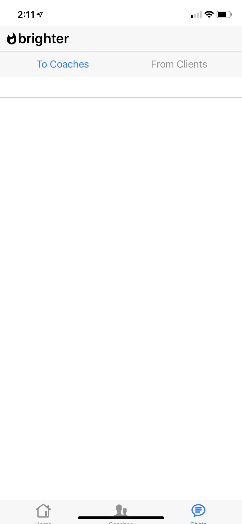
I believe that F7 takes care of adjusting the bottom and top spacing on mobile phones to account for camera and bottom items. When I place my web app onto the iPhone XR home screen the overall size of the app is too large so that bottom nav is partially hidden. It looks like F7 correctly expanded the height of the nav bar to account for the bottom ‘notch’ on the XR but the overall size of the app was not adjusted.
It could be that F7 does not pick up that its running in the webkit that Apple uses for home screen web apps which is different than iOS Safari.
Its hard to tell whether it works with kitchen-sink because most pages are scrollable lists … except for the /badges page which has a bottom nav example. That seems to have the correct spacing when its displayed on the iPhone XR. How can I see the source for /badges? When I do viewsource I just get the main kitchen-sink page even if I am viewing the /badges page.
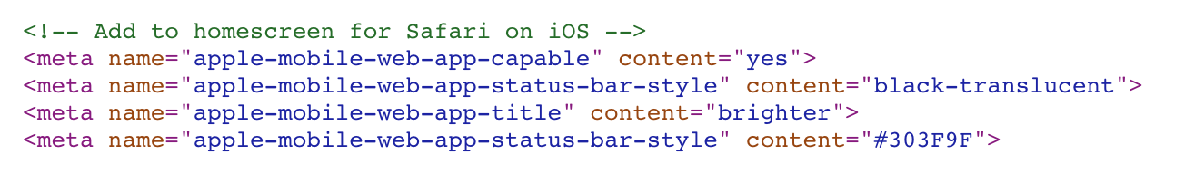
Check required meta tags in index.html and make sure you have the same. Not sure how did you created an F7 project but project created with F7 CLI has all set correcrly
I used one of the open templates by I dont think it was updated to the latest F7 version.
The only difference I see is that kitchen-sink index has “safe-areas” added the view classes. I was under the impression from the docs that this was only needed for landscape mode. Portrait was said to be handled automatically? Just for kicks I tried “safe-area” and as expected it helped the left and right sides in landscape mode (nice!).
In portrait orientation Framework7 will do required styles modifications automatically, but in landscape orientation some additional classes must be added to elements
[https://framework7.io/docs/safe-areas.html](Safe Areas documentation)
Its interesting to me that the bottom nav with icons gets the extra height that is needed but that the main view remains longer than it should be so the nav is push down.
I will pore through the files again to see if I missed something but it looks like I have the same tagging in place.
Yes, all those metas match what I have on mine. It seems like the bottom nav-bar (tab bar) sizes correctly giving it extra padding. The overall view does not seem to size down correctly to insure everything fits on the XR screen.
Why does apple-mobile-web-app-title effect the safe-area layout? Although apple will default to for the home screen app title I would rather control it directly using that tag.
It would be good to add the iOS specific meta-tag requirements to the safe-area documentation page when you get a chance
It looks like the apple-mobile-web-app-title does not effect your calculation for safe-area so I was able to add that back in.
It was the duplicate status bar style that messed up the spacing. That line came from the framework7 template I was using so I contacted that owner to let them know they have the extra meta-tag in their template.