I have a strange problem.
I´m using a fixed bottom toolbar layout and when I open the camera to take a picture to upload then the half the toolbar gets hidden, it moves half the toolbar down so half is hidden.
And this only when the webapp is opened in fullscreen, added to the homescreen, if I open it just in Safari this is not happening.
And the strange thing is that if I instead open the image gallery and just select an already taken picture then it is not effecting the toolbar. (opening the keyboard on the same page when writing something in an input field is not effecting the toolbar)
So what can be the problem and how can I solve it?
Any input really appreciated, thanks.
For me sounds like could be an iOS issue. More details or live example on how to replicate it?
Hi Vladimir. You can test it https://www.manmade.se/dumpen/appen/ and login with [email protected] and clacke11, and you will see it in the first tab if you click and select the image button and then try to take a picture, and also if you click the camera icon, that will open the camera at ones. Thanks a lot. And it only when added to the home screen.
Another strange thing is, if I test it in my old iPhone 4s and my old iPad2 then it is no problem, but it happens in an iPhone 6s with the latest iOS.
Hi Vladimir. Did you have any time to look at it? I would really, really appreciate it. Since I don´t know how to fix it, or what the problem is. Or why the page-content becomes higher when I have taken a picture, but not when I select a picture.
Thanks a lot for your help.
Hi,
I test it on browser.
I only get the error when i use the app with full width. If i set mobile device it works ok.
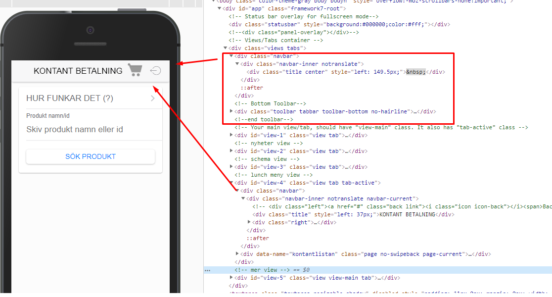
Also, looking at the source code i think that your navbar layout is wrong.
you have a common navbar and toolbar, but also set a navbar for each view. its kind of odd. Whats the reason of doing this?
Here you can see, each view (in this case view-4) has a nav
Common navbar:
https://framework7.io/docs/navbar.html#common-navbar-type
Hi pvtallulah
Thanks for testing, yes it only happens when you add it to the homescreen and take a picture, not if you just look in Safari or not if you just select an already taken picture from the gallery.
Regarding the navbar I need it in the pages since I use dynamic navbars,and the common one in the index file is for the computer layout. When you look on the computer, the page itself is just 700px wide, but I wanted the navbar to stretch over the hole page, 100%, so the´s what its for 
I have been testing to make the page and page-content div less high, using a fixed toolbar etc, but nothing works.
Is there a way to refresh the page-content div(since thats the one that is getting expanded when taking a picture?) without reloading the hole page?
A problem I have is that I have an old iMac with OS El Capitan and a new iPhone 6s and they don´t have the same version of Safari and therefor I can´t use the web inspector on my computer to really test it  Noting is displayed in the inspector from my phone.
Manmade, i dont own a mac. Just a VM. But simulator dosnt emulate a camera. So i cant test it. If i have a chance to get an iphone i will test it.
Thanks pvtallulah.
I start to wonder if it has something to do with the statusbar. It seams like the toolbar gets pushed down about 20pixels, and thats what the statusbar is. I think that when I take a picture, it can´t calculate the proper hight of the screen - page somehow? Or maybe I´m totally wrong 
How did you test it? Can you simulate an app added to the home screen in the browser? What are you testing with?
Im testing in Safari with the “responsive design view” when I want to see how it looks in an iPhone(if I don´t want to do it in my actual phone) And when I test it in there with the iPhone 8 simulator I don´t get the problem. I can only see the problem in an actual phone.
On iPhone X with latest iOS i can’t see such problem with something changing when i open/close Camera view from input. But i see that there is something wrong with Toolbar in general, it kind of cut off. Guess something wrong with styles
Thanks Vladimir.
And you added it to the home screen? I just tested yesterday on an iPhone Plus and its the same problem there.
What do you mean with “kind of cut off” ? Can you please take a screenshot?
I think that the only thing I have done is to change the height to 56px and adjusted the page-content bottom-padding accordingly.
I guess that I have to take one of the demo apps from scratch and test it, so it is only framework7 stuff, nothing that I have changed and see if the problem is solved or not .
Actually from what I see all correct now
I downloaded the latests version of the tab layout template and just added
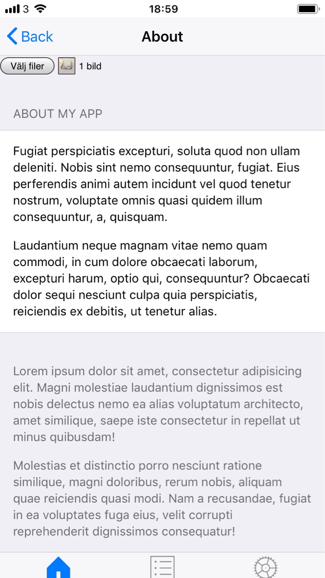
<input type="file" id="files" name="files[]" multiple style="width:100%;" required/>
to the about.html page inside the page-content class. Added it to my home screen and took a picture and it moved down the toolbar. So it is nothing I have done in my code Thank god for that haha.
But the problem is still a problem haha.
I have to find a way to be able to debug the actual app in the phone, since it is not working in safari anymore since the versions are not the same in my computer and phone.
The new test app is here if you want to test it. https://www.manmade.se/dumpen/www/index.html
Can you upload screenshot of the issue from actual device?
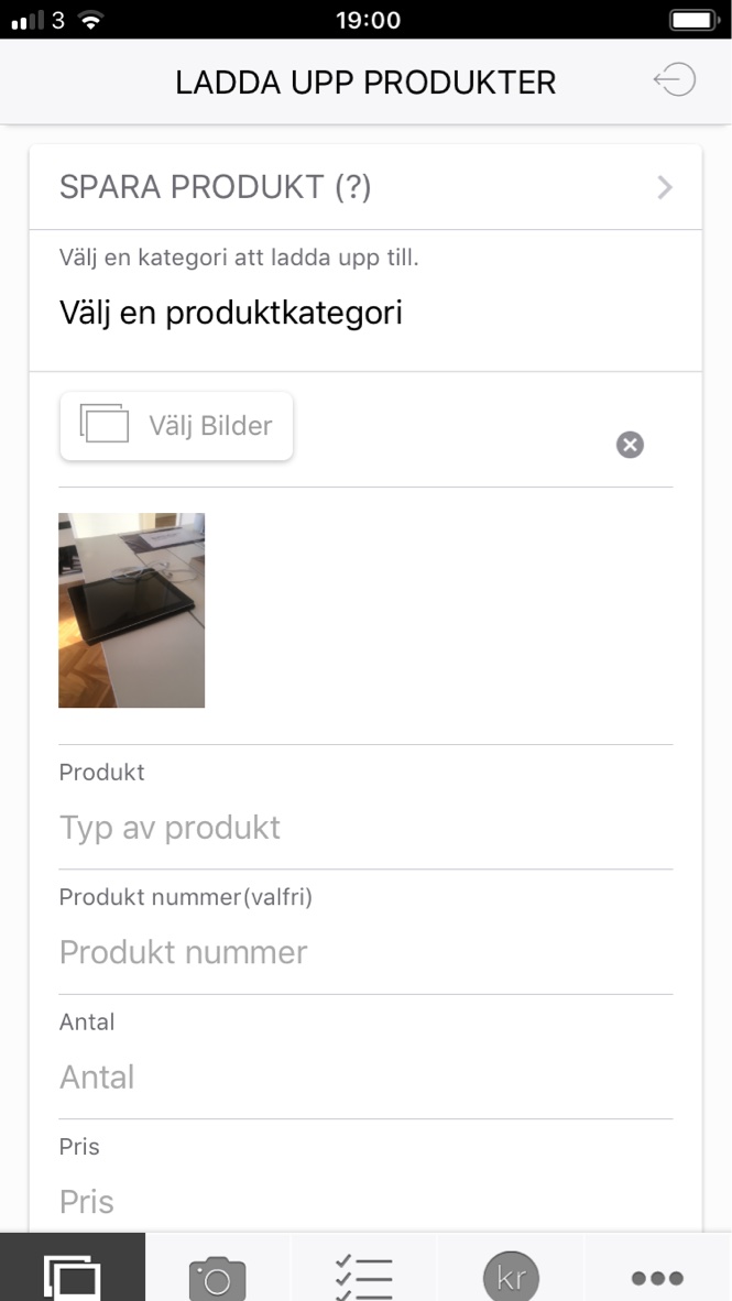
Here are the one from the new test app and the second one is from my app.
As you see at the bottom, the toolbar is cut of.
My phone is an iPhone 6s, but I tested on an iPhone 8 + yesterday and its the same problem.
Thanks Vladimir.
Ok so I finally solved it!
First I checked the original window height when the page loads, and then I checked it again after I had taken a picture, and it had added 20px to the .views class(pushing down the toolbar). So after the picture was taken, then I set the .views class to the original window height to fix the problem.
But then a new problem came along haha.
When I after had taken a picture, if I then selected an input to write something about the picture I was uploading, then when the keyboard was closed it had moved the hole view up 20px.
But I solved it to, so if you are making an camera app, you might have the same problem, so here is the solution.
var $orginalwindow = $(window);
function checkOrginalHeight() {
	orginalwindowheight = $orginalwindow.height();
        //console.log('orginalwindowheight before picture is taken '+orginalwindowheight)
    }
    // Execute on load
    checkOrginalHeight();
//reset the view when the keyboard is closed
document.addEventListener('focusout', function(e) {window.scrollTo(0, 0)});
    $$(document).on('page:init', '.page[data-name="persits"]', function (e) {
    var page = e.detail;

    document.getElementById('files').onchange = function (e) {

    	$('.views').height(orginalwindowheight);
        ...
And since this only happened when the app is added to the home screen I only run it inside the fullscreen check.
    if (app.device.webView){

    }

 Noting is displayed in the inspector from my phone.