Where do I find a template app with tabbars? And what is wrong with mine?

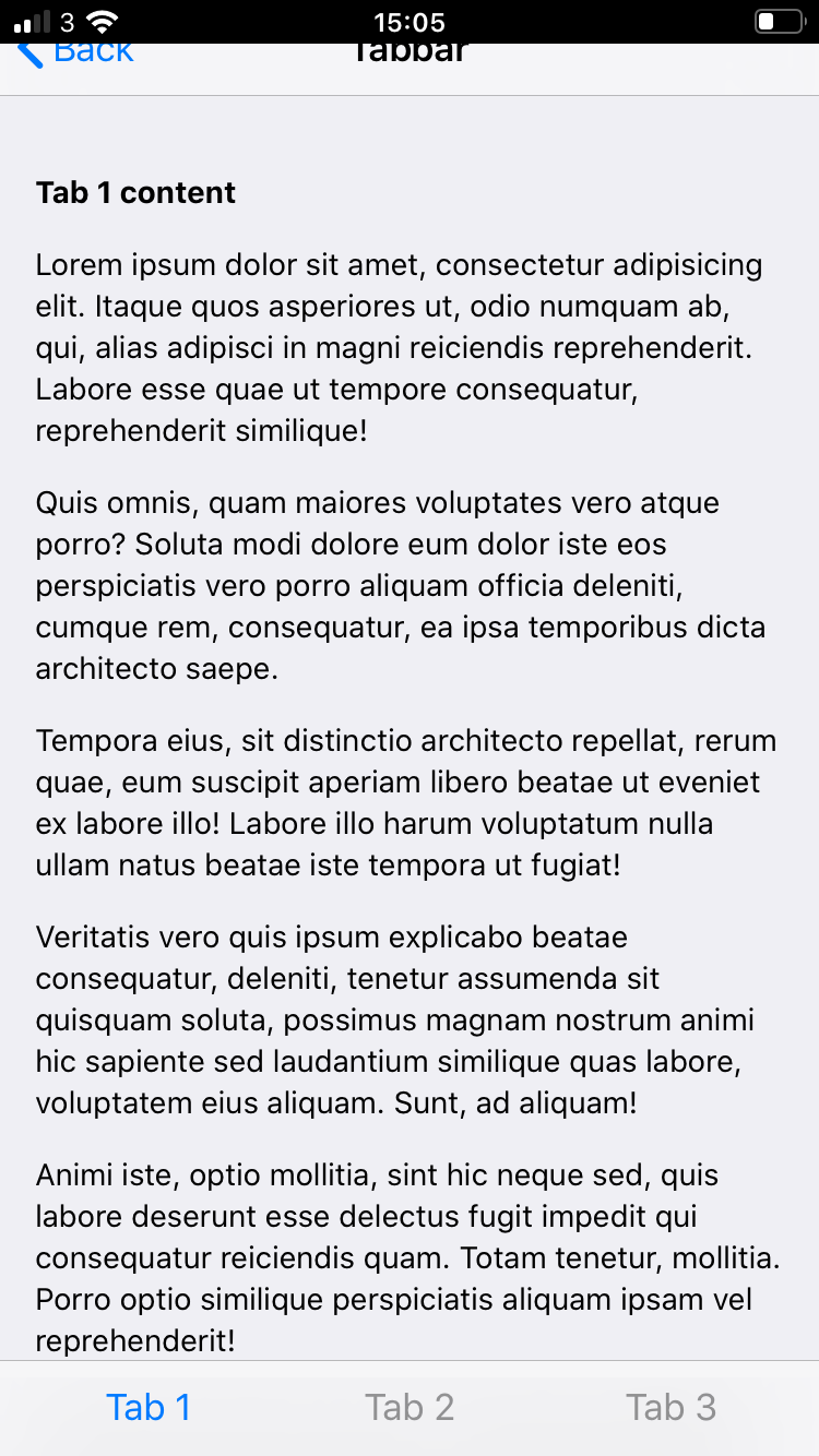
Where do I find a the latest working tabbar template I can look at to see how a tabbar layout should look with the latest framework version 5.5.1? Im only using framework7 js and css files, none of my own.

Problem In standalone mode.
I have the below and when I change orientation to landscape(the title is not centered) and back to portrait, then the navbar is hidden underneath the statusbar on the iPhone as you can see on the images.

This is my layout now, what am I doing wrong?

<body>
<div id="app">
<div class="views tabs"> 
     
      <div id="view-1" class="view tab tab-active  safe-areas"></div>
      <div id="view-2" class="view tab  safe-areas"></div>
      <div id="view-3" class="view tab  safe-areas"></div>
      <div id="view-4" class="view tab  safe-areas"></div>
      <div id="view-5" class="view view-main tab  safe-areas"></div>
      
        <!-- Bottom Toolbar-->
      <div class="toolbar tabbar toolbar-bottom no-hairline">
        <div class="toolbar-inner">
            <a href="#view-1" class="tab-link tab-link-active">
            <i class="icon tabbar-demo-icon-1"></i>
            </a>
            <a href="#view-2" class="tab-link" id="cameratab">
            <i class="icon tabbar-demo-icon-2"></i>
            </a>
            <a href="#view-3" class="tab-link">
            <i class="icon tabbar-demo-icon-3"></i>  
            </a>
            <a href="#view-4" class="tab-link">
            <i class="icon tabbar-demo-icon-4"></i>
            </a>
            <a href="#view-5" class="tab-link">
            <i class="icon tabbar-demo-icon-5"></i>
            </a>
        </div>
      </div>
      <!--end toolbar-->
      
</div>
</div>
</div>

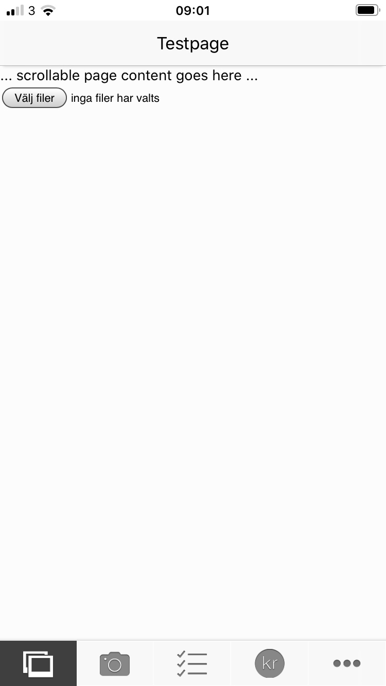
And the test page that Im loading in all the different views looks like this.

<div class="page" data-name="about">
 <div class="navbar">
  <div class="navbar-bg"></div>
      <div class="navbar-inner">
        <div class="title">Testpage</div>
      </div>
    </div>
  <div class="page-content">
    ... scrollable page content goes here ...
    <input type="file" id="files" name="files[]" accept="image/*" multiple  required/>
  </div>
</div>

How the page looks when I load it at first, as it should.


In landscape the title is not centered and the bottom toolbar is not visible.

Back in portrait the hole page is shifted up by 20px and is underneath the statusbar and the bottom toolbar is 20px from the bottom screen(hard to see in this the pic if you don´t select it)

Please, any input appreciated because Im going crazy :wink:

Did you create your project through the CLI or manually?

Hi kerry. I did it manually. And trying to have it as simple as possible when testing this.

Take a look at this previous answer and see if it helps you: Statusbar CSS gradient background

Thanks, but no. I tested with the .device-cordova.device-ios {
height: 100vh;
} and with iosOverlaysWebView: false but no change.

No matter what I test, the navbar is still hidden underneath the statusbar after coming back from landscape to portrait.

What am I missing, I can’t figure it out??

I also tested the https://framework7.io/docs-demos/core/toolbar-tabbar.html from the docs and it has the same problem, the navbar is hidden here as well. So I guess it has nothing to do with my code, its a bug in the framework7?

I hope that Vladimir knows what to do to fix it, because I have run out of things to test.

This can be used only with cordova app or with statusbar style black-translucent (HTML meta tag).

For correct layout, create new app with Framework7-CLI and see how it is done there

Thanks Vladimir.
I just, finally got it working.
Im testing on an iPhone 6s with iOS 13.4 and I guess this problem is on all iPhone 5,6,7,8 and 6,7,8 Plus as well.
The problem is viewport-fit=cover in

<meta name="viewport" content="width=device-width, initial-scale=1, maximum-scale=1, minimum-scale=1, user-scalable=no,minimal-ui, viewport-fit=cover">

So if I use the above for iPhone X, 11, 11pro etc and later models to come and when NOT in standalone mode and then use the below to detect if it is an iPhone earlier than iPhone 8, than it works on my iPhone 6s.

    if(app.device.iphone) {
	
	 // iPhone X
    if ((window.screen.height / window.screen.width == 812 / 375) && (window.devicePixelRatio == 3)) 
	{
       app.dialog.alert("iPhone X")
		} 
		
	// iPhone 6+/6s+/7+ and 8+    
	else if ((window.screen.height / window.screen.width == 736 / 414) && (window.devicePixelRatio == 3))
	{
		document.querySelector('meta[name=viewport]').setAttribute('content', 'width=device-width, initial-scale=1.0, minimum-scale=1.0, maximum-scale=1.0, user-scalable=no');
        app.dialog.alert("iPhone 6 Plus, 6s Plus, 7 Plus or 8 Plus")
	}
	// iPhone 6+/6s+/7+ and 8+ in zoom mode	
    else if ((window.screen.height / window.screen.width == 667 / 375) && (window.devicePixelRatio == 3)) 
	{
		document.querySelector('meta[name=viewport]').setAttribute('content', 'width=device-width, initial-scale=1.0, minimum-scale=1.0, maximum-scale=1.0, user-scalable=no');
        app.dialog.alert("iPhone 6 Plus, 6s Plus, 7 Plus or 8 Plus (display zoom)")
	}
	// iPhone 6/6s/7 and 8	
    else if ((window.screen.height / window.screen.width == 667 / 375) && (window.devicePixelRatio == 2))
	{
		document.querySelector('meta[name=viewport]').setAttribute('content', 'width=device-width, initial-scale=1.0, minimum-scale=1.0, maximum-scale=1.0, user-scalable=no');
        app.dialog.alert("iPhone 6, 6s, 7 or 8")
	}
		
    // iPhone 5/5C/5s/SE or 6/6s/7 and 8 in zoom mode	
     else if ((window.screen.height / window.screen.width == 1.775) && (window.devicePixelRatio == 2)) 
	{
		document.querySelector('meta[name=viewport]').setAttribute('content', 'width=device-width, initial-scale=1.0, minimum-scale=1.0, maximum-scale=1.0, user-scalable=no');
        app.dialog.alert("iPhone 5, 5C, 5S, SE or 6, 6s, 7 and 8 (display zoom)")
	}
		
    // iPhone 4/4s	
     else if ((window.screen.height / window.screen.width == 1.5) && (window.devicePixelRatio == 2)) 
	{
		document.querySelector('meta[name=viewport]').setAttribute('content', 'width=device-width, initial-scale=1.0, minimum-scale=1.0, maximum-scale=1.0, user-scalable=no');
        app.dialog.alert("iPhone 4 or 4s")
	}

}

So for anybody that has a problem with the navbar getting hidden underneath the statusbar in standalone mode, test this, it is probably your problem.

And since this is a problem for all iPhones below iPhone X maybe it can be added to the core?