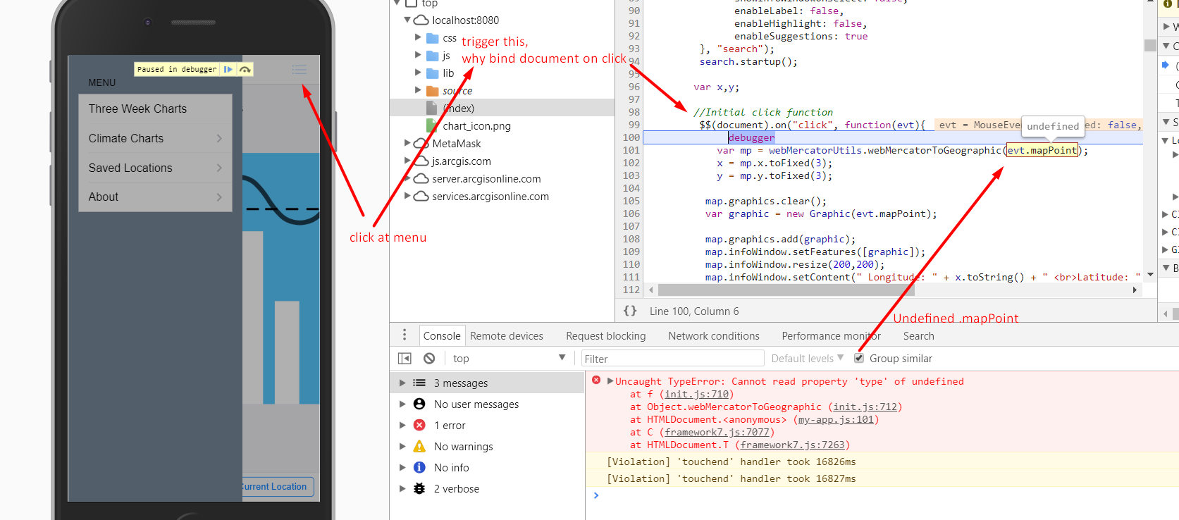
I have single view v1 app with href toolbar buttons and panel overlay links to four different HTML pages within the app. I can navigate back and forth for a bit, but after a certain point, I can’t click the back button, and none of the toolbar links or the overlay menu. I’m stuck on whatever page. I’ve tried setting domCache to true and false in the JS and it’s not making a difference. Aside from this, the app is working and ready to distribute.
Here is the first part of my JS and the index.html.
JS
var myApp = new Framework7();:
var $$ = Dom7;

// Add view
var mainView = myApp.addView('.view-main', {
    // Because we want to use dynamic navbar, we need to enable it for this view:
    dynamicNavbar: true,
	domCache: false
});

// Handle Cordova Device Ready Event
$$(document).on('deviceready', function() {
    console.log("Device is ready!");
});

$$(document).on('click', '.panel .forecast-charts-link', function searchLink() {
  // Only change route if not already on the index
  //  It would be nice to have a better way of knowing this...
  var indexPage = $$('.page[data-page=index]');
  if (indexPage.hasClass('cached')) {
    mainView.router.load({
      pageName: 'index',
      animatePages: false,
      reload: true,
    });
  }
});
HTML
<!DOCTYPE html>
<html>
<head>
    <!--
        Customize this policy to fit your own app's needs. For more guidance, see:
            https://github.com/apache/cordova-plugin-whitelist/blob/master/README.md#content-security-policy
        Some notes:
            * gap: is required only on iOS (when using UIWebView) and is needed for JS->native communication
            * https://ssl.gstatic.com is required only on Android and is needed for TalkBack to function properly
            * Disables use of inline scripts in order to mitigate risk of XSS vulnerabilities. To change this:
                * Enable inline JS: add 'unsafe-inline' to default-src
        -->
   <!--  <meta http-equiv="Content-Security-Policy" content="default-src 'self' data: gap: https://ssl.gstatic.com 'unsafe-eval'; style-src 'self' 'unsafe-inline'; media-src *">
 -->
    <!-- Required meta tags-->
    <meta charset="utf-8">
    <meta name="viewport" content="width=device-width, initial-scale=1, maximum-scale=1, minimum-scale=1, user-scalable=no, minimal-ui">
    <meta name="apple-mobile-web-app-capable" content="yes">
    <meta name="apple-mobile-web-app-status-bar-style" content="black">
    <meta name="format-detection" content="telephone=no">
    <meta name="msapplication-tap-highlight" content="no">

	<link rel="stylesheet" href="lib/framework7/css/framework7.ios.min.css">
    <link rel="stylesheet" href="lib/framework7/css/framework7.ios.colors.min.css">
	<link rel="stylesheet" href="https://js.arcgis.com/3.24/esri/css/esri.css"/>
    <link rel="stylesheet" href="lib/font-awesome-4.5.0/css/font-awesome.min.css" />
	<link rel="stylesheet" href="css/styles.css">


    <!-- Your app title -->
    <title>MetCon</title>

    <!-- This template defaults to the iOS CSS theme. To support both iOS and material design themes, see the Framework7 Tutorial at the link below:
        http://www.idangero.us/framework7/tutorials/maintain-both-ios-and-material-themes-in-single-app.html
     -->


</head>

<body class="theme-blue">
    <!-- Status bar overlay for full screen mode (PhoneGap) -->
    <div class="statusbar-overlay"></div>

    <div class="panel-overlay"></div>
  <!-- Left panel with cover effect-->
  <div class="panel panel-left panel-cover">
    <!--<div class="content-block">-->
    <div class="content-block-title">Menu</div>
	<div class="list-block">
      <ul>
        <li>
          <a href="#" class="forecast-charts-link item-content list-panel-all close-panel item-link">
            <div class="item-inner">
              <div class="item-title">Three Week Charts</div>
            </div>
          </a>
        </li>
		<li>
          <a href="climate_charts.html" class="charts-link item-content list-panel-all close-panel item-link">
            <div class="item-inner">
              <div class="item-title">Climate Charts</div>
            </div>
          </a>
        </li>
        <li>
          <a href="saved_locations.html" class="favorites-link item-content list-panel-all close-panel item-link">
            <div class="item-inner">
              <div class="item-title" >Saved Locations</div>
            </div>
          </a>
        </li>
      </ul>
    </div>
  </div>

    <!-- Views -->

<div class="views">
    <div class="view view-main">

      <!-- Top Navbar-->
     <div class="navbar">
    <div class="navbar-inner">
        <div class="left">
            <a href="#" class="back link">
                <i class="icon icon-back"></i>
                <span>Back</span>
            </a>
        </div>
        <div class="center sliding">MetCon</div>
        <div class="right">
            <a href="#" class="link icon-only open-panel"><i class="icon icon-bars"></i></a>
        </div>
    </div>
</div>
      <!-- /End of Top Navbar-->

      <!-- Now we need additional "navbar-through" and "toolbar-fixed" classes on Pages -->
      <div class="pages navbar-through toolbar-fixed">
        <div data-page="index" class="page">
         <div class="page-content">
            <p style="font-size:150%;"><b>Three Week Charts</b></p>
			<img class="responsive" src="chart_icon.png" alt=""/>
          </div>

          <!-- Bottom Toolbar-->
          <div class="toolbar">
             <div class="toolbar-inner">
             <a id="choose" href="map_B.html" class="button button-medium">Choose Location</a>
             <a id="current" href="map_A.html" class="button button-medium">Use Current Location</a>

            </div>
          </div>
          <!-- /End of Bottom Toolbar-->

        </div>
      </div>
    </div>
  </div>

 <!-- End of Views -->

    <script type="text/javascript" src="cordova.js"></script>
    <script type="text/javascript" src="lib/framework7/js/framework7.min.js"></script>
    <script type="text/javascript" src="js/my-app.js"></script>
	<script type="text/javascript" src="https://debug2.phonegap.com/target/index.js#ee5dc974-230e-11e8-9450-0615b500c154d"></script>
    <script src="https://js.arcgis.com/3.24/"></script>
</body>

</html>