🖥 Desktop theme feedback needed

Hey guys!

I’m thinking about to start working on desktop theme for desktop apps for v4. So we can go here in two directions:

  1. Separate macOs and Windows themes
  2. New custom common desktop theme

1st approach with new separate macOs and Windows themes seems obvious but after some investigation i have doubts about it. Recently I checked a lot of Electron apps, and none of them looked like a system app, for example: Visual Studio Code, GitHub Desktop, Slack, Skype, Whatsapp, Discourd, Figma, Notion (this one is really great done).

So i guess we need to go with 2nd approach by just creating new custom desktop theme. Because looks like no one really interested in creating app that will look like system Settings app. Most of electron apps i see utilize custom branding and lots of them look really great.

In this custom desktop theme i can combine best of both iOS and MD themes and tweak them to look better on desktop.

But on other side, with separate macOs and Windows themes we will get as much native look as possible, but customizing your app design will be pretty complex work. But another question, what should it look like on linux-systems? They all have custom design :slight_smile:

So guys, what do you think, which way should we go?

4 Likes

I am a Linux user, but for my work I use Windows sometimes and I like to see the applications on both desktops in the same way. So my “vote” is for a common theme.

4 Likes

Same here, also vote for #2 (Common theme).
Btw. will new theme run also on mobile or desktop only?

3 Likes

Hi Vlad, personally, I’m quite undecided. I find that there are a lot of (subtle) differences between a Mac application and Windows. The first one that comes to mind is that on Mac applications there are no or few effects on hover (and in my memories there are them all over Windows). This is why, for example, the Slack, Trello etc. applications on Mac doesn’t look native at all, everything shines when you move the cursor over the elements. Moreover, on Mac, everything is more refined, smoother, the elements are more rounded, text & titles are more contrasting etc.

So I think I vote for #1 but both will be fine with me :slightly_smiling_face:

Thanks for your work, v4 rocks

1 Like

I vote for #2: one general desktop theme, based on the ‘best features’ of the iOS and MD themes.
But I would prefer if you could focus on essential components that are missing in Framework7. For me that is: an extensible and customizable WYSIWYG editor (simple and extended).
Thanks for all your effort!

3 Likes

Hi Vladimir, I would also prefer a unified desktop theme.

Cheers,
Bálint

3 Likes

Я за единую тему, систем много, зачем под все подстраиваться, да и нет какого-то единого стиля для того же Windows, все оформляют как хотят. Главное, сделать возможность нетрудной стилизации.

Big fan of this project, well done Vladimir.

My preference would be a universal browser theme - after all, websites are the same regardless of the browser or platform you use. I would then use this same theme for desktop/electron apps.

1 Like

Ok, guys, the work is going and it is about 50% ready. Just to clarify, this theme will be for desktop apps, so everything there (all sizes) will be a bit or much smaller.

One more thing to decide. Which should be the page transition, in most of desktop apps there is no any transitions in this case, but we need one. Do you have good examples of nice but simple animations?

At the moment I did it like simplified transition of what we have now in iOS theme. New page just slides in from right, but previous page stays intact.

1 Like

Demo: https://tympanus.net/Tutorials/CSS3PageTransitions/index2.html#home
Source: http://tympanus.net/Tutorials/CSS3PageTransitions/CSS3PageTransitions.zip
Description: https://tympanus.net/codrops/2012/01/30/page-transitions-with-css3/

Very simple page transition effect implemented by CSS3-rule:
transition: opacity 0.6s ease-in-out;
just to differ from MD and iOS transition effects with no bells and whistles

There are more sophisticated effects at
https://tympanus.net/Tutorials/CSS3PageTransitions/index.html#home
and
https://tympanus.net/Tutorials/CSS3PageTransitions/index3.html#home
but imho they do not meet the needs of Framework7 for desktop apps

1 Like

I have used f7 for several desktop apps and websites. I would go with 2.

Some thing I tend to have to add in desktop ones is

  -webkit-app-region: drag;

on the navbar for electron, keyboard shortcuts on modals (enter and esc) and things like sortable tend to work differently on web (not a little anchor but the whole element drags). Also hover classes for links and buttons and maybe also hover tooltips.

Looking forward! Thanks a lot!

1 Like

Yep, hovers in my todo list. Can you tell more about -webkit-app-region: drag;, what issues did you have with it?

No issues, just suggesting some smart defaults

1 Like

Hi Vladimir,

What a great idea! You work hard, with unbelievable results, congrats!
I would also prefer a unified desktop theme, easer for personalization and maintenance.

Guillaume

1 Like

Amazing job! We can not wait to see the Desktop theme!

1 Like

One more thing to decide. Which should be the page transition, in most of desktop apps there is no any transitions in this case, but we need one. Do you have good examples of nice but simple animations?

For me the better transition is like you said : no transition. I’ve never seen a slide or fade transition on a Desktop app.

So I think that by default there should be no transition. With an option to add a transition if you want, and in this case it should be a fadeOut/fadeIn transition, which is the most appropriate.

The slide transition is exclusively intended for mobiles.

1 Like

Ok guys, thank you all for your feedback!
The new desktop theme is almost ready, just need to polish it a bit and a few tweaks left.

So the new desktop theme name is Aurora. I decided to go with some none-relevant name rather than call it Destkop to avoid confusing with “desktop” as device in API and styles.

Main idea of this theme is to provide styles and sizes more close to what we have in desktop apps, so using this theme should require less efforts to customize it.

I kept simple slide-in from right transition for pages by default, which of course can be disabled, and it looks pretty good. Also some of native macOs desktop apps have such transition too.

So i would like you to help me to finish it and do kind of testing. To run this theme:

git clone https://github.com/framework7io/framework7.git
cd framework7
git checkout aurora-wip
npm install
npm run core:dev

And on home kitchen sink page, switch to Aurora theme in the bottom.

You will see everything here is a pretty much smaller. What is also new:

  • There are hovers on buttons and list links
  • Picker now works with mousehweel to scroll through items
  • Pull to refresh now also works with moushewheel
  • There is a new Appbar component
  • Some of components look pretty different from what is in iOS and MD themes, some of look like in iOS or MD theme

I would like you to check it and give some feedback, is something there looks wrong, maybe something doesn’t work, maybe something is missing, or any other issues?

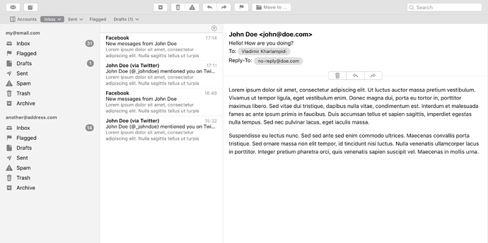
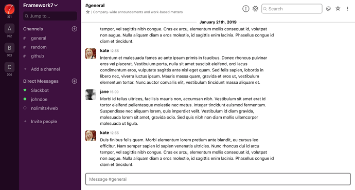
Also would be good if some of you can create so called a Proof Of Concept (POC) by recreating any desktop app appearance with Aurora theme. I already created two, you can find them in /samples/ folder in repository. These are just concepts, and showing possibility to build such interfaces, they have no any logic, just an app appearance.

I have created one for macOs Mail app:

And another one for Slack app:

I spent about an hour for each of these mockups (Slack was harder :slight_smile:), and already can say that with aurora it became much simpler.
If you would like to help me with this, just pick the desktop app you want or like and make its appearance with f7-aurora, no any logic needed, just HTML + CSS. And send PR with it or send it to me directly.

And later we can make repository with such samples for usage as starting points.

5 Likes

Wow! It’s pretty impressive that you only need to add ~50 lines of CSS to design the macOS Mail app from Aurora’s components!

1 Like

Awesome, will make a few and upload.

1 Like

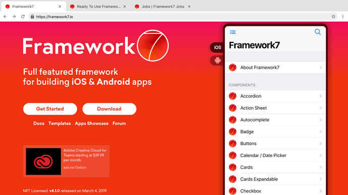
Also added Google Chrome POC to samples :slight_smile:

1 Like